
It’s like an Easter egg, but all the color is inside the shell.
The WAN Color in Architecture Award celebrates projects that harness color to dramatically transform a building or enhance the experience for its users and community. The winning design was selected from a shortlist of six entries by an expert judging panel. After assessing the shortlist in depth, the judges were unanimous in their admiration for this project, which they considered a standout winner for successfully expressing a design philosophy that treated color as a key consideration throughout.
McBride Charles Ryan of Melbourne, Victoria, Australia, has been announced as the winner of the WAN Color in Architecture Award 2016 for their Ivanhoe Grammar Senior Years & Science Centre, a project that places a vibrant and engaging use of color at the heart of the design concept.
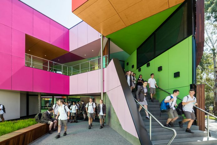
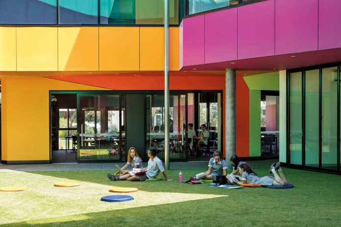
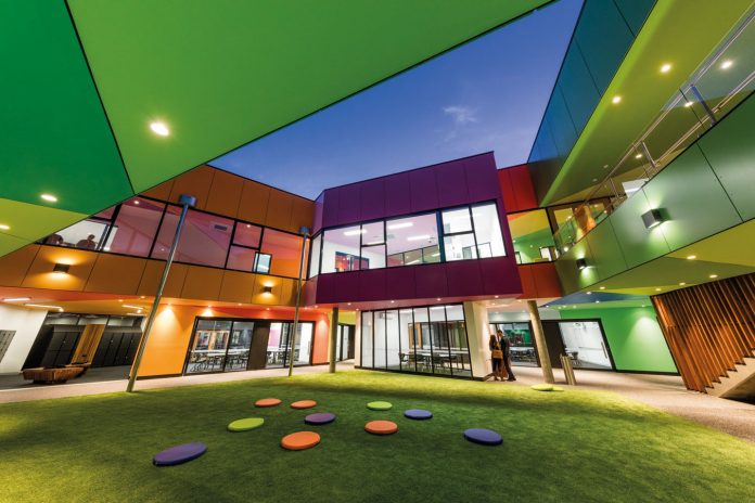
The brief for this new school building included a variety of general learning areas, provision for the senior year teachers and a science center. The circular shaped plan had an appropriate civic quality based on the school’s original masterplan. However, rather repeating the circular pattern inside, the designers chose to use geometry and color to define the central courtyards, light wells and learning spaces. The sharp angles and vivid colors of the interior form a dramatic contrast with the round form and muted tones of the drum-like outer structure. At key entry points, the drum is ‘eroded’ to reveal the wonders of science and learning expressed through this vibrant design.
“I think that what fascinates me – and what makes it a winner – is that this project is obviously about color from the start,” said judge Per Nimer, Design Manager at Akzonobel.
The designers were inspired by the idea of an eggshell hiding an inner core, and by kaleidoscopes, where a view inside reveals seemingly infinite combinations of color and pattern.
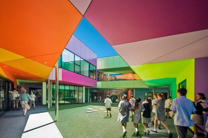
“It does look like an egg and when you break it open, there’s this jewel of colors in the middle,” said another judge, Karen Haller, Applied Color Psychology Consultant at Karen Haller Color & Design.
The contrast evident in the building’s language encapsulates contemporary methods for a well-rounded education. The classic circular form represents the order and certainty of knowledge, while the building’s expressive and complex inner world represents the uncertainty of modern life and scientific understanding, and the necessity of wonder and imagination to see us through. Zlatko praised the accurate response of the design to its context as a school building, combining the serious with the playful.
“I think that it works in the context of Australia, where there’s bright sunshine. For kids, it must be brilliant,” said the third judge, Morag Morrison, Partner at Hawkins\Brown.
Overall, the judges agreed that this project exemplified the Award’s aim to champion designs using color to create a more dynamic and communicative built environment.
“For the whole premise, that there’s an architectural firm looking to bring color to the beginning of the design and not at the end – that’s to be commended,” said Haller.
[photography by John Gollings]


