For more than 40 years, 116 W McDowell Road sat empty, a single-family lot filled with dirt and trash. Today, the space is home to a building that its owners hope will be looked to as a shining example of what downtown Phoenix can become.
“I’ve lived in downtown Phoenix for more than 20 years, and I still believe in downtowns,” said Russ Haan, the co-owner of Max & Lucy and After Hours, the two businesses that occupy the building’s ground level. “This is our way of saying hey Phoenix, wake up! This is what you should be doing downtown.”
Indeed, the contemporary, masonry, aluminum and steel building seems to be an anomaly on a block filled with small medical offices and empty lots. The exterior of the building also appears deceptively small from the street. While it houses two businesses, it also serves as Haan’s home, providing a cozy, lived-in feeling even amid the minimal modern design.
Haan, who had been thinking about working on such a project in downtown Phoenix for years, bought the land in 2004 and broke ground in 2005. Due to contracting snafus, the building was completed more than a year after the projected date, but Haan was finally able to move in October 2007.
Haan enlisted celebrated Valley architects, [merz] project, to realize his idea of a 24/7 occupancy, live/work structure in the middle of a downtown that is still looking for its architectural identity.
“It was a really good partnership,” Haan said of working with the firm, one of about 15 firms he interviewed, out of which only five agreed to even think about doing the project because of its special requirements. “We didn’t have an exact idea of what we wanted it to look like, but we knew how we wanted it to function. We signed off on a plan with [merz] and after that there were virtually no changes.”
Joe Herzog, [merz]project architect, said the design process was extremely collaborative.
“We were able to have thorough dialogue about light, shadow, materials, movement, as well as the functional characteristics of the spaces we designed,” Herzog said. “While there were disagreements about specific elements as we went through the process, I think those elements often became some of the building’s strongest aspects.”
The offices and an adjoining gallery have vaulted ceilings, giving the workspace an open-air feeling. Windows spanning nearly floor to ceiling provide enough natural light, so that during the day the space feels as close to being outside as one can feel minus the summer desert heat.
Magnetic boards span the length of the creative work environment, allowing art and paperwork to be hung, in addition to a hanging art system installed throughout the building. A lounge and kitchen area situated in front of the windows blend seamlessly with the remainder of the office.
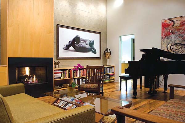
Floating oak stairs lead to a room Haan uses as a think space, and doubles as a guest room when he hosts visitors overnight. An elevator ride to building’s third floor exposes Haan’s residence. The living quarters feature a cozy, yet supremely elegant kitchen and living area, complete with oak floors and an explosion of windows, allowing natural light to stream through. The kitchen offers a stove facing the living room because cooking and eating are a huge social deal, Haan said.
The apartment is abutted by a large deck designed for entertaining, accented with planting beds and a hot tub all framed by a breathtaking view of downtown Phoenix.
Haan acknowledges that while the design of the apartment might be more sophisticated than most, it is still designed in a way that allows for relaxed, unstuffy day-to-day life.
“It’s fussy enough in the design,” he said “We’re not fussy in the way we live. We want people to come over and hang out. This was designed with living in mind.”
In fact, the building was designed keeping every detail in mind. Everything from the air conditioning vents–designed as a separate design element, but meant to blend in with the rest of the room, to the placement of the air conditioning in the gallery–in front of the windows as to circumvent the heat that might come charging through on a summer day, was carefully considered.
Also meticulously planned out was the use of space. A small area off the basement, which provides vast storage space, will soon be transformed into a wine cellar. Negative space under a stairwell is employed as a computer room.
“In the end, we designed a Swiss watch that has no unnecessary parts,” Herzog said. “While there was enormous thought and ingenuity that went into every detail, I think the poetry of the spaces still dominates an individuals perception of the building. People are amazed at the volume of spaces and the play of light and shadow. Each space has its own character that relates to a different time of day and light quality.”
For Haan, who admits overseeing the project was a full-time job, says now that the building is finally completed, the headaches were all worth it, especially if his building inspires similar projects downtown.
“This should be the template,” he said. “Not the floorplan, but the idea. Building 100 of these in the empty lots down here would make Phoenix an architectural destination worldwide.” [photos: Don Cross
[latest articles]
Selva Restaurant: A Design Inspired Dining Experience in Amsterdam
New Home of Toronto’s Museum of Contemporary Art
Nordic Architecture and Sleek Interior Design
Charting a New Course at Compass House
