Upon entrance into the employee lounge of most large companies, one might see white walls, institutional seating, Formica tabletops, and fluorescent lights.
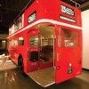
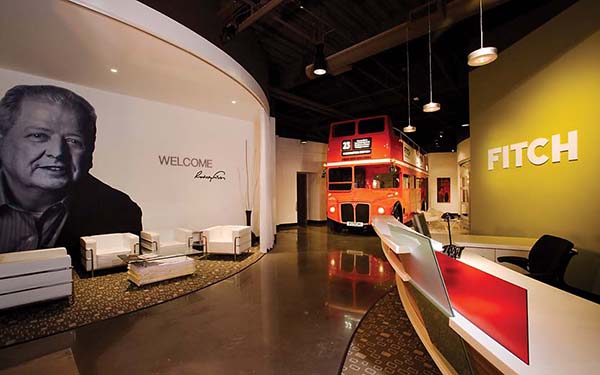
Upon entrance into the employee lounge of the new Phoenix headquarters of London-based design firm, FITCH, one can expect shag carpeting, psychedelic beanbag chairs and lava lamps, not to mention that the trip to the lounge requires walking up the stairs of an authentic 1963 British double-decker bus parked in the lobby.
The lounge and bus–the first floor serves as a conference room–are just two of the many unique elements incorporated into the design of the new office in an effort to provide a creative work space for employees and to reflect FITCH’s basic philosophies.
“The bus takes into consideration the ideas of boldness, humanity, and meaning,” said Sean McGuiness, director of marketing. “We’re being bold in putting [it] in the middle of our lobby. The human aspect comes in because this bus transported people for 45 years, and it’s meaningful because it relates to our roots as a UK company.”
The four months it took creative director, Brian Harvey, and his team to restore the bus serves as a testament to the amount of work and attention to detail it took to make the FITCH office unique.
While the bus is the largest focal point in the office, just as much thought went into even the tiniest of details, according to McGuiness.
For example, a wall leading to the administrative offices uses sculptural elements to tell the story of how FITCH came into being, the different disciplines in which it works, and how it fits into the family of Wire Plastic Products, its parent company. A vintage 1955 refrigerator door at the end of the wall is covered with postcards from the other FITCH offices welcoming the Scottsdale office to its new home.
Across from the wall is a 1000-square-foot design library overseen by a part time librarian.
“It’s what makes the design team a powerhouse,” McGuiness said. “We pride ourselves on the organization of the library.”
Another element in the main design office is known as the FITCH family wall. Made up of rows of brightly colored circles threaded together and fastened to the ceiling, one side of each circle is a portrait of an employee blowing a bubble out of bubblegum; the other side features a personal phrase chosen by the employee. McGuiness said the idea was to create a visual interest point while giving employees a way to become connected with their workspace.
In keeping with that idea, the main conference room was built with glass doors that slide open to the lobby so the space is acoustically open to employees during large meetings. In addition, the office kitchen utilizes stainless steel and glass tile to provide a bright, open area for employees to gather during lunch breaks.
The result being the FITCH building is a place where associates take pride over their space. “We have clients visiting on a daily basis, and I am always ensured that the studio will be spotless, even though it is a very busy office, because of the pride everyone takes in their space,” McGuinness said.
While the FITCH office tries to provide a comfortable space for its employees, it was also designed with an eye to the community in the Valley. An artwalk area in the office allows local artists to display their work; if they sell it during an open gallery, 20% is donated to the Leukemia and Lymphoma Society.
The office was also designed with the world at large in mind. The space complies with green standards by making use of natural light and energy-efficient lighting, recycled and high-recycled content materials and the installation of CO2 sensors.
Studio director, Adam Rickle, said employees and clients have noticed a change in the air since the move to the new office, as people aren’t coughing and no one ever complains about their sinuses.
Harvey said designing the building with green elements in mind wasn’t just about meeting standards.
“It’s not important [to incorporate green building elements] just to get certified,” Harvey said. “It’s important because it’s the right thing to do.”
The time and energy put into the new building has had a noticeable positive impact on both employees and FITCH clients.
“A regular office does not fit the type of work we do. If we are courting a restaurant group to design their next concept, the idea of giving them a tour through a typical office would not carry the same impact as bringing them through our new space.,” McGuinness said. [photos: Al Tutton Photography]
[latest articles]
Selva Restaurant: A Design Inspired Dining Experience in Amsterdam
New Home of Toronto’s Museum of Contemporary Art
Nordic Architecture and Sleek Interior Design
Charting a New Course at Compass House
