Sometimes we get tired of right angles. It happens to the best of us.
When a French couple bought an apartment in the Paris suburb of Sceaux (pronounced so), the apartment had remained unchanged since it was built in the 1960s. It was a typical apartment of the time with boxy, closed rooms. One of the selling points, however, was two terraces with large windows and glass doors–one in front and one in the back of the apartment.
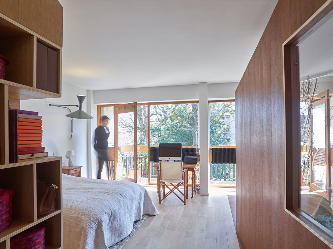
H2O Architectes was commissioned to design the renovation because of their unique approach to redesigning the interior architecture. Their challenge was to create a modern space within all of the structural elements and infrastructure which had to remain unchanged.
To start, all of the non-load-bearing walls were torn down to open up the apartment as much as possible to give the architects a ‘free plan’ to design around. The main idea was to keep the apartment open enough to take advantage of the natural light coming in from both sides.
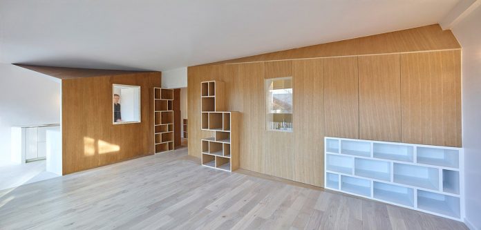
Rather than just put up new walls in a different configuration, distinct volumes were designed to organize the space. Each one is an open box made from a different wood to differentiate between the functions. The ceilings of the boxes have slopes that detach from the ceiling to give the impression they are free-standing. The effect is heightened with the walls being offset at different angles. Each one also has a window to create interconnectedness between the spaces.
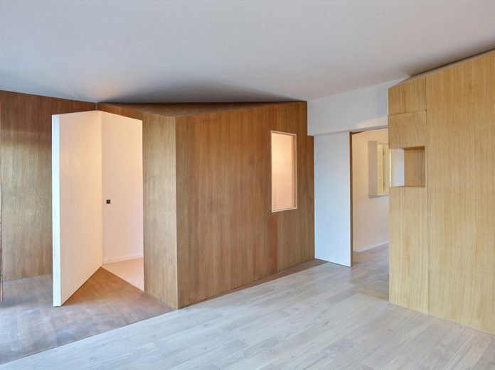
The wall between the original two bedrooms was eliminated to create a larger room with a window wall out to the full-length terrace. One of the ‘boxes’ was built into the bedroom to create a small guest bedroom with a wall that opens to the terrace window. The area is small enough that usable space is maintained between the guest bedroom and the terrace.
The main living area in the front of the apartment was opened up with a semi-enclosed kitchen, dining area, and living room all benefiting from the full-length terrace.
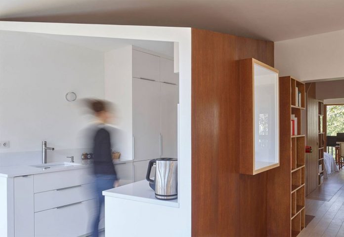
The kitchen was formerly closed off with the only entrance from the entry hallway. A new ‘box’ contains the kitchen which is semi-open to the window wall and main living area. The kitchen also defies right angles by being narrower in the back and opening wider towards the front.
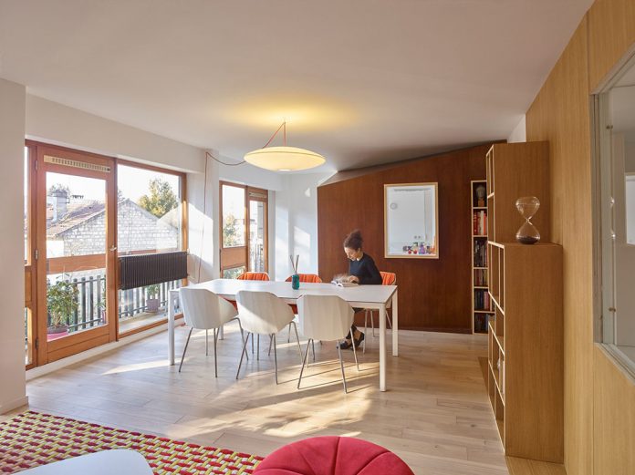
The living room is open and spacious, enhanced by the abundance of natural light pouring in from the terrace window wall and the panoramic views of the surrounding green urban environment.
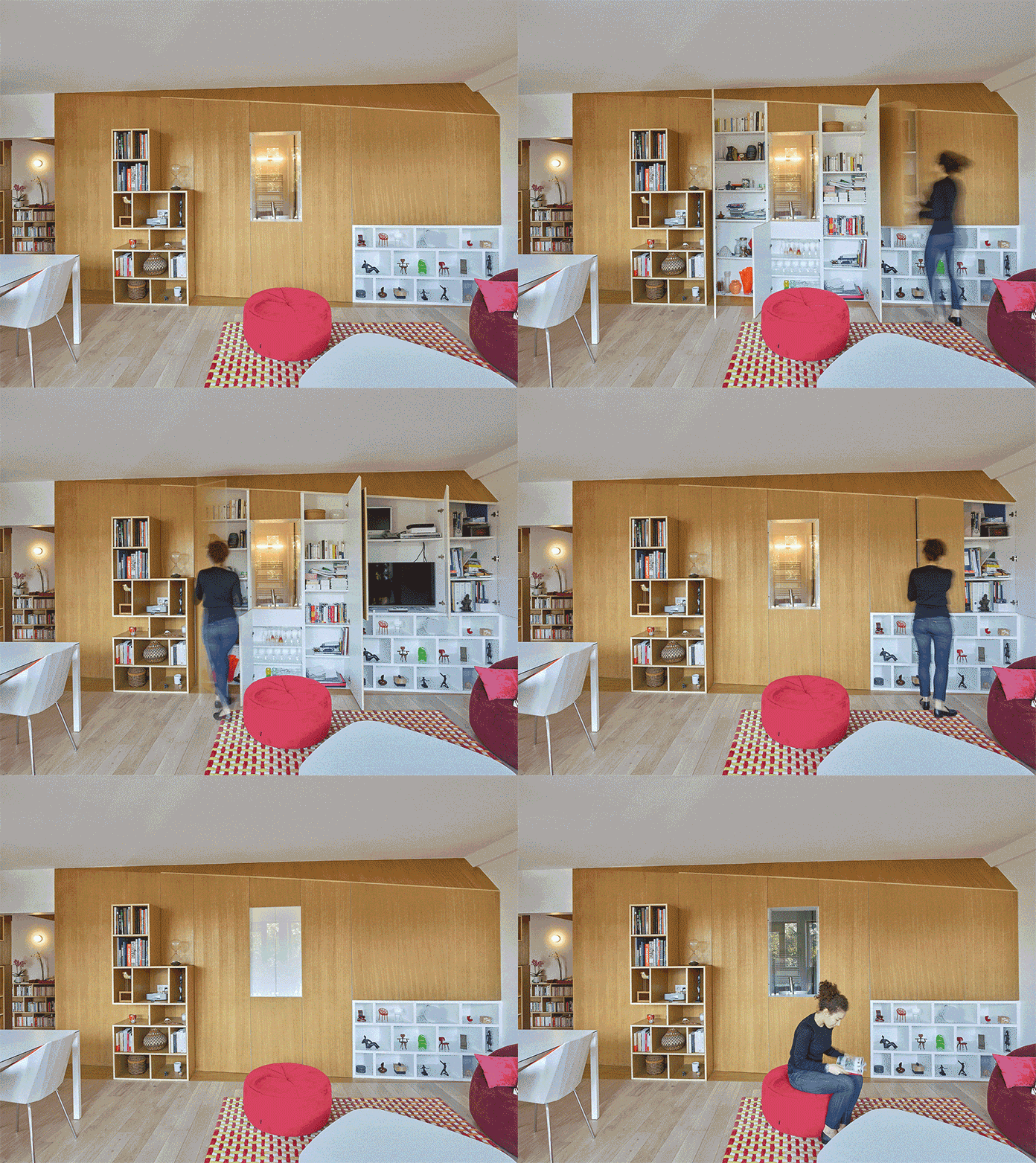
In addition to the ‘boxes’ being set at different angles, each one contains a plethora of built-in shelves and cubbies for ample storage. The built-in between the living room and the bathroom is extra-functional with the wall consisting of doors to storage areas and the entertainment center.
The overall effect of the interior architecture opened up the space to the natural light and an efficient use of the volume created even more livable area for the couple to enjoy.
[Photography by Stéphane Chalmeau][latest articles]
Selva Restaurant: A Design Inspired Dining Experience in Amsterdam
New Home of Toronto’s Museum of Contemporary Art
Nordic Architecture and Sleek Interior Design
Charting a New Course at Compass House


Your point of view caught my eye and was very interesting. Thanks. I have a question for you.