Edmunds.com wants to win awards. There’s no other explanation.
They’ve been awarded the Best Places to Work by the Los Angeles Business Journal for seven years straight, the Glassdoor Employee’s Choice for Highest Rated CEOs, and the Computerworld 2016 Best Places to Work in IT just to name a few. They like to share the love, too. They hired M+M Creative Studio to design their new ‘EdQuarters’ in Santa Monica, CA and now the architects are winning awards.
Last November, The American Architecture Prize awarded M+M Creative Studio the Silver Award for Commercial Interior Architecture and a Bronze Award for Workplaces for 2016. Last month, they were honored with the 2016 International Space Design Award, IDEA-TOPS as the winner of “The Best Office Design Award”, selected from over 650 applicants worldwide. Chances are, they’re just getting started.
It doesn’t take a PhD to figure out the two types of awards are linked by more than just the name of the company. Edmunds.com has an overall philosophy that appears to be grounded in caring for their employees and setting them up to succeed. Their philosophy accepts that their employee’s triumphs are the company’s triumphs and not the other way around.
EdQuarters is a whopping 143,000 square-feet on two floors blending designs reflecting the automotive and technology intersection of the company. Part of the square-footage is a 10,000 square-foot exterior central atrium connected to the interior spaces by 130-feet of sliding glass doors. Inside the atrium are round tables and benches, planters, gurgling water features, and LED lighting.
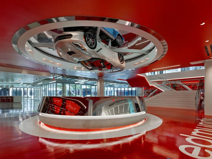
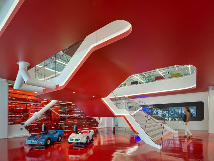
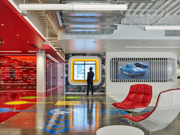
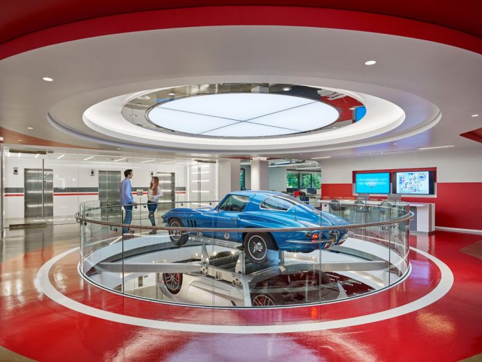
The first floor is designed to wow guests and also provide community spaces and amenities for the employees. Upon entering the main entrance, guests are greeted by a receptionist behind a round polished chrome desk with a 2016 Corvette Stingray rotating upside-down above it. Another Stingray, this one a 1966 version to commemorate the company’s 50th Anniversary, is set wheel-to-wheel and is seen right-side-up from the 2nd floor.
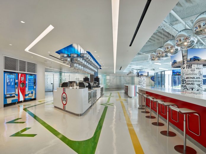
For amenities, the first floor includes a main lounge for employees to gather and interact with a long coffee bar, a frozen yogurt station, and a 1948 Cadillac that has been converted into a beer tap and bar. The lounge includes booth seating for working and relaxing and features a mosaic of the Edmunds logo formed from over 2,400 Matchbox cars. Speaking of Matchbox cars, next to the free soda vending machines, there is also a Matchbox car vending machine.
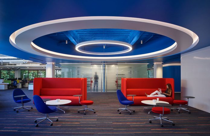
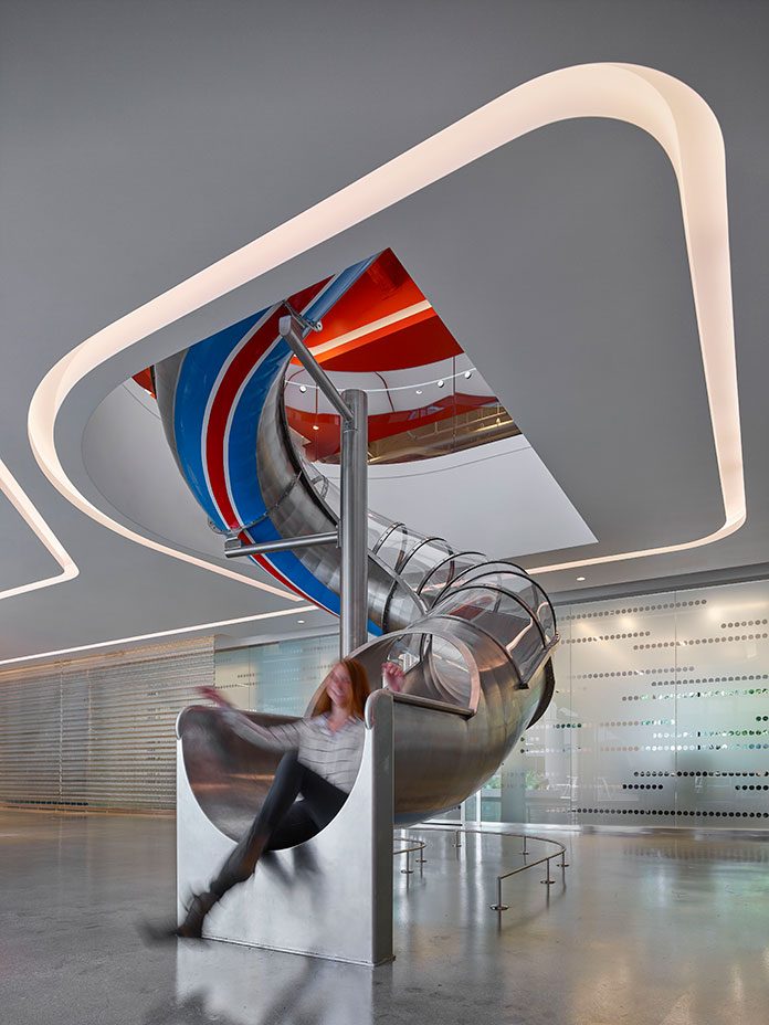
The red lacquered floor of the entryway is reflected on the red underside of the flowing stairway to the second floor. The second floor is mostly open with workstation comprised of plank-desking system that allows for flexibility in workspace. There are meeting rooms scattered about and an employee lounge. There are small quiet rooms called Rest Stops (sounds suspiciously like safe spaces) and an IT service desk called The Pit Stop. But the pièce de résistance might just be a 35-foot slide down to the 1st-floor for those who are feeling like Fred Flintstone at the end of the day.
With an office like this, no wonder Edmunds.com is winning Best Place to Work awards and M+M Design Studio is winning architecture awards. I might even consider moving back to LA to work in this office space.
[photography by Benny Chan][latest articles]
Selva Restaurant: A Design Inspired Dining Experience in Amsterdam
New Home of Toronto’s Museum of Contemporary Art
Nordic Architecture and Sleek Interior Design
Charting a New Course at Compass House
