
There is an old adage that one cannot fit a square peg into a round hole, but for Mark and Stacey Kranz, their professional careers as an architect and an interior designer lent the knowledge to make it work for their outdated, inefficient Phoenix “Gingerbread House”.
With a growing family and a steady stream of family visitors throughout the year, the Kranzes were ready for an extensive redesign. Not only was the young family interested in more functional space, garnering lower energy bills was also an attractive feature of the renovation.
“We are creative people, but most of the problems we answered in our renovation were from a functional standpoint,” said Mark. “We did not approach too much from a stylistic angle, we just focused in on solving our functional problems while still making the house fit into the neighborhood.”
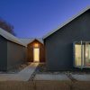
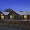
The original structure of the Kranz residence featured wooden fish scale siding, asphalt shingle roofing and faux shutters on two bedroom windows, the only two windows that allowed visual access to the street. Designed more for Middle America than the middle of the desert, the wood siding was incapable of withstanding the Arizona sun, along with the landscape.
“It was the textbook developer subdivision,” said Mark, architect for SmithGroup. “Nothing about the place knew that it was in the desert. We were constantly asking ourselves how we could take this very average tract home that inherently lacked any sense of its place in the desert, so we tried to pretend that we were starting from scratch, even though the basic bones of the house were never touched.”
After moving there in 2001, the couple completed a remodel of their kitchen in 2003 and a partial remodel of their bathrooms. Finally ready for a major expansion, the couple hired Waltz Construction as a general contractor in 2006. Design development, renovation permitting and construction began shortly thereafter. With a three-year-old and two newborn daughters, the design strategy focused around their growing family and relatives from the Midwest who are frequent visitors.
“Functionally, we needed bedrooms for the girls and a dedicated office, because we both work from home,” said Mark.
A primary component of the expansion is the added office space. The office frees up bedroom space and is adjacent to a utility area that can serve as the children’s playroom or a private guest bedroom with a rolling frosted glass door to separate it from the office when needed.
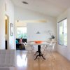
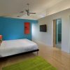
The redesigned living room area incorporates open space with white Knoll Barcelona chairs, a Copenhagen sofa, a Bertoia Diamond chair and a Brayton custom ottoman that gives the area a spacious feel. The Kranzes also removed the antiquated popcorn ceilings and installed new maple wood floors.
“Not only is the family provided with a new adequate living space, but the interiors offer more natural light that spills through the house,” said Stacey. “We started with the white background. It wasn’t a matter of using bright colors, we just prefer vibrant, crisp and clean spaces.”
Natural light and energy efficiency were key drivers throughout the design and renovation process. A metal roof that absorbs less heat and is more visually appealing replaced the original asphalt shingle roof. Insulated low-e glazing replaced all windows and doors, while skylights and concealed indirect lighting were installed throughout the house. Insulation and synthetic stucco add thermal protection to the structure’s exterior, and despite expanding their residence by 350 square feet, their utility bills are significantly lower than before.
“We wanted to maximize our biggest natural resource: the sunlight,” said Mark. “We also incorporated aluminum shade boxes on our windows for the ability to take advantage of the light in our house without having the heat.”
The most dramatic effect of the re-master planning of the Kranz residence may be in their backyard, which has been transformed to two separate, distinct settings. Originally, in order to access the side yard, one was forced to exit the rear of the house and go through a back gate. Oriented toward a small backyard, over half of the site was rendered useless, and steep topography on two sides was causing severe erosion.
The backyard now offers a pool and play area for the children adjacent to a shaded circular patio nestled in the middle of an aloe garden and outdoor fire pit. The landscape and recreational features present various outdoor options depending on the time of the day and time of the year.
“A lot of people think of their first house as a throwaway, but you can take something that is average and make it into something special if you have patience,” said Mark. “Some of the changes [we made] were substantial, but by relying on our biggest ally, the natural light, our home now feels twice as big and is twice as comfortable for our young family.” [photos: Mark Boisclair and Don Crossland]
[latest articles]
Selva Restaurant: A Design Inspired Dining Experience in Amsterdam
New Home of Toronto’s Museum of Contemporary Art
Nordic Architecture and Sleek Interior Design
Charting a New Course at Compass House




Your article helped me a lot, is there any more related content? Thanks!
Can you be more specific about the content of your article? After reading it, I still have some doubts. Hope you can help me.
Thanks for sharing. I read many of your blog posts, cool, your blog is very good.