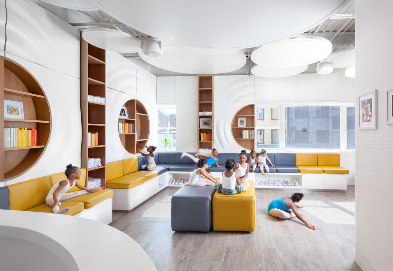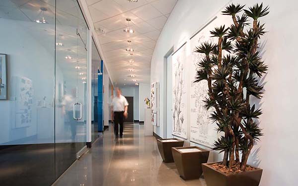
Ask anyone if good design is good for emotional health and the answer will likely be a resounding yes. Ask anyone if good emotional health is good for business and again the answer will likely be a resounding yes. Does it follow then, that good design is good for business? Ask a designer or an architect and you might also ask if one-legged ducks swim in circles or if Phoenix summers are hot. The answer is yes, good design is good for business.
“Good design is one of the single most important aspects of good business,” said Morris A. Stein, principal in architectural giant HKS Inc.
So much for any nuance in that hypothesis. Considering the ubiquitous reach of commercial design and that every day, everyone is affected by commercial design, there is a conspicuously absent consciousness about how and to what extent commercial design affects both the emotional health of the individual and the collective. On one hand, designers are pioneering progressive techniques that are improving workplaces and maximizing profit and productivity. On the other, strip malls and boxed stores are homogenizing cities across the country. In a word, the effects of commercial design on our emotional health are total.
HKS Inc.’s Phoenix offices fit the profile precisely–an urban district undergoing revitalization, a re-imagined industrial building, a stripped down staircase ascending from a great room divided into cubicles scarcely resembling cubicles at all. One thing is certain, even in its simplicity, the HKS offices, especially in juxtaposition with the endless drab counters, the static fluorescent lights, and the suffocating bureaucratic apathy of, say, the local Motor Vehicle Division, make a vibrant case for the affecting qualities of good design. Then again, it is an architectural firm.
But HKS, Inc. exports its ideology far beyond its office walls. Stein jokes that bad design has resulted in people seeing the word hospital, but reading house of pain. He has made a brand, if not an art, of designing large-scale medical campuses, including the Arizona Heart Hospital and the Phoenix Children’s Hospital.
“It’s easy to design for product,” he said, pointing to the example of medical imaging technology such as MRI machines. “It’s easy to think that technology will improve quality.”
Stein argues that this is not necessarily the case. He believes good design designed around experience will ultimately yield significantly greater health, human and economic returns. In the case of a medical facility, Stein believes that by creating pleasing buildings, the design community will improve patients’ medical experiences, improve physician and staff satisfaction, and galvanize the trust of the public. This will lead to improved MRI images (the patient is more relaxed, fewer bad images), higher overall productivity, faster recovery times, and a healthier bottom line. His argument also seems to be, more fundamentally, that good business is only possible with good design.
“Good design can help attract and retain good employees and can attract consumers and highlight products,” said Deborah Schneiderman, assistant professor for the College of Design at Arizona State University. “This generation of graduates does not fit the nine to five model. They are seeking companies that provide architectural and lifestyle flexibility, space they are able to personalize, as well as collaborative spaces, break areas, and even fitness and shower facilities.”
Indeed. Parked in the indoor lobby of the newly opened Phoenix office of worldwide architectural firm, FITCH, is a full-size red double-decker bus, England’s iconic workhorse of public transportation. It is there, says Creative Director Brian Harvey, as a representation of FITCH’s ethic of producing quality design that reaches the masses. With 18 locations in 10 countries, FITCH is a one stop design shop; part architectural firm, part design firm, and part ad agency that boasts a client list including some of the world’s most endemic retail and restaurant chains. The offices, designed by Harvey, are as imaginative as they are contemporary and unique. Environmentally conscious throughout (in accordance with LEED Silver standards) with a focus on natural light and open space, Harvey added small touches intended to cultivate freedom and creativity within the office. For example, he placed the break room, visible even from the reception area, in the lobby opposite the double-decker, which, incidentally, is a conference room in the bottom deck and a beanbag-filled lounging space in the open upper deck. Having the break room in plain view of clients and guests (though there is a revolving design piece able to partition it off during special events), Harvey says, creates a self-cleaning dynamic that results in happier staff and cleaner surroundings. Another innovation is a gallery space featuring the work of local artists. Not only an aesthetic contribution, the gallery is also a bridge that commutes goodwill and art sale proceeds to the community.
“Color is energy and it can enhance, revive and renew any space,” said Carol Smith. Smith is a residential color therapist, but says there is definite fluidity between the effects of color at home and at the work place. “The right colors can make a substantial difference. Red stimulates, excites and warms. Violet heightens awareness and enhances dignity. Orange reduces fatigue and stimulates the appetite and creativity.” The important thing, she added, is to find color that is congruent with the personality of the home or office.
Congruence in design and business is even more encompassing. “Creating a functional design goes beyond the design of the physical space, there has to be an attitude in the work philosophy of the company that meshes with the physicality of the space,” added Schneiderman.
“People say they’d come here even if the food wasn’t good,” said Christine McHale, owner of Palatte, a newly opened breakfast and lunch hotspot at 4th Ave and Fillmore. Something of an accidental designer, McHale describes the rustic chîc décor as what she’s always done in her dorm rooms and apartments.
“Two things,” said Bill Sandweg about the impact of design on his flourishing 7th Ave coffee shop, Copper Star Coffee. “By not falling into the strip mall trap, we stand out. That has brought some extra press.”
Since opening a year and a half ago, Copper Star Coffee has quickly become a local favorite, drawing an eclectic clientele of urban hipsters, professionals, and neighborhood regulars. While Sandweg, a sometimes architecture junkie, seems to have brewed a successful formula, he notes with a trace of disappointment, that the contemporary minimalist design is actually a compromised version of his original plans. But Sandweg’s disappointment is not with Copper Star Coffee’s final manifestation, rather it’s with the muddled permitting process that repeatedly hampered his initial vision with a well-meaning lack of flexibility and frankly, chutzpah. “Phoenix is a high-growth city and they’re simply overworked,” stated Sandweg.
The effect is disadvantageous to local businesses. “Chains can run their plans through the permitting office quickly because they’re building from scratch out in the desert and because the plans have been stamped dozens of times before,” explained Sandweg. The implication is that Phoenix’s level of growth not only increases sprawl but also decreases imagination and city character. The silver lining, says Sandweg, is a dramatic decrease in competition in the city center. Sandweg points to Pizzeria Bianco, Pane Bianco, La Grande Orange and Postino as examples of businesses that have endured the chutzpah-deficient permitting office and found niches in which to excel. Of course, the success of Sandweg and others like him also demonstrates the viability of the market and, in a cruel twist of irony, invites chains to move back downtown–a silver, but perhaps fleeting, lining after all.
“It’s a market economy. If there wasn’t demand for it, it wouldn’t be happening,” said FITCH’s Brian Harvey, nursing a trace of the tormented idealist as he notes the irony of driving through endless city sprawl to get to his well-designed office. “One of the most unfortunate outcomes of the big boxed store is the destruction of the main street.
“On the other hand, good design should be available to everyone. Big boxed stores have the ability to make this possible,” said Schneiderman. “And good design is really only good if it is sustainable and healthy.”
Good design is good for business. In corporate offices, hospitals, restaurants, and coffee shops, design is positively impacting our cultural, economic, environmental, and physical health. Design is also intricately entwined in more adverse phenomena that impact our cultural, economic, environmental, and physical health. Such is the reach of design. Good design is good for business. As obvious as that may be, as the effects of design become more shared within and across communities, good design that is only good for business, may cease to be good design.
[latest articles]
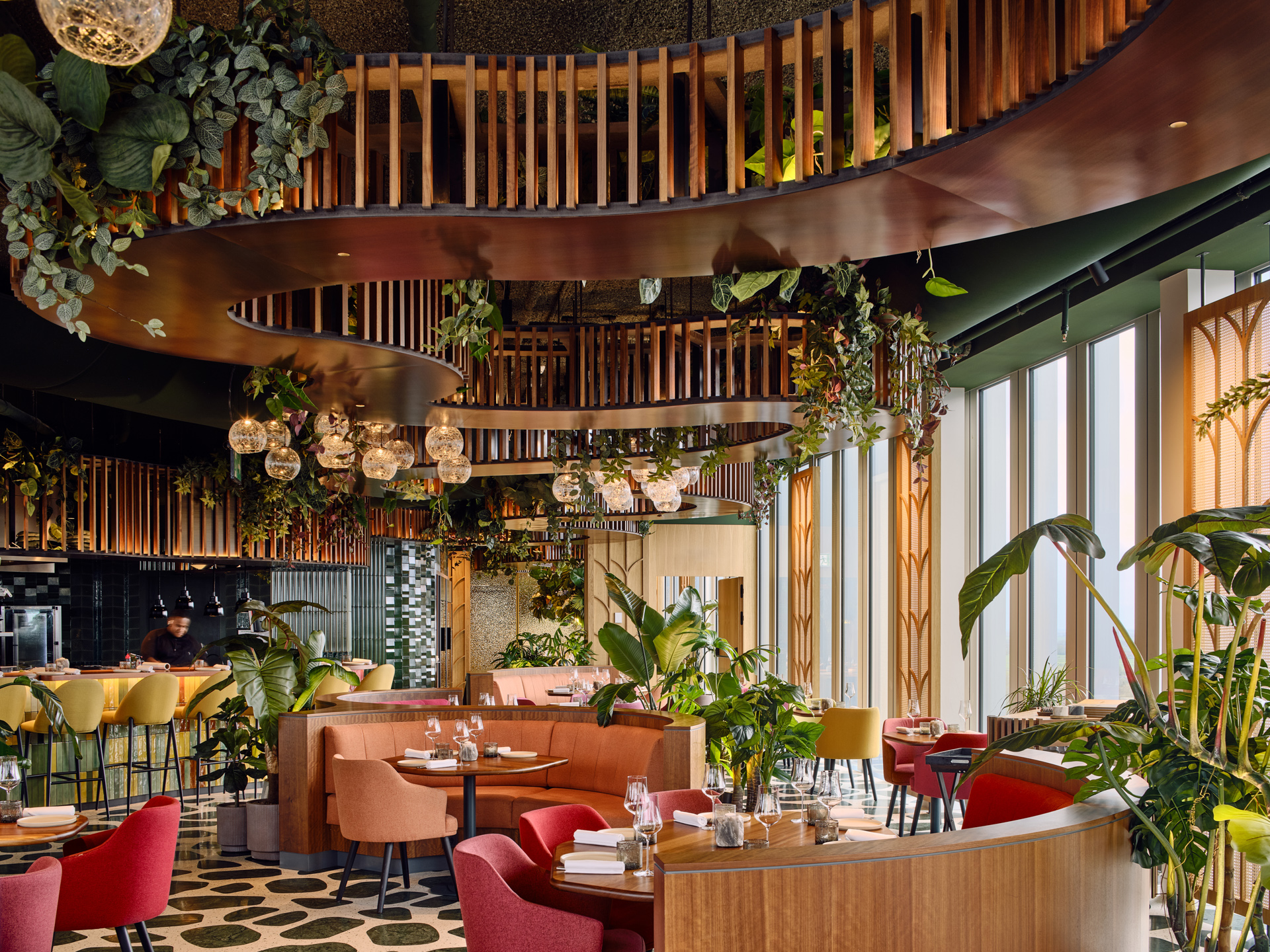
Selva Restaurant: A Design Inspired Dining Experience in Amsterdam
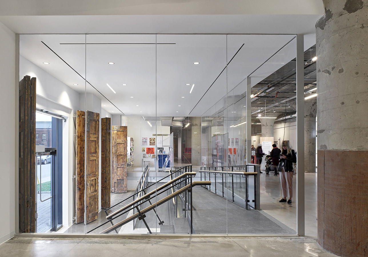
New Home of Toronto’s Museum of Contemporary Art
Nordic Architecture and Sleek Interior Design
Charting a New Course at Compass House
