“The March Hare will be much the most interesting, and perhaps as this is May it won’t be raving mad – at least not so mad as it was in March.” – Alice, Lewis Carroll’s Alice in Wonderland.
In the interests of madness, this article should perhaps be titled How to Turn an Architecture Description into a Literature Lesson.

From the architect: The March Hare in Alice in Wonderland is a multifaceted character who guides the tale, inviting Alice on a curious induction to a world of adventure. Through the stimulation of Alice’s imagination, the March Hare subverts the landscapes of daily life, and the new world begins to deviate from everything Alice holds as familiar. Cheongdam March Rabbit was inspired by the March Hare.
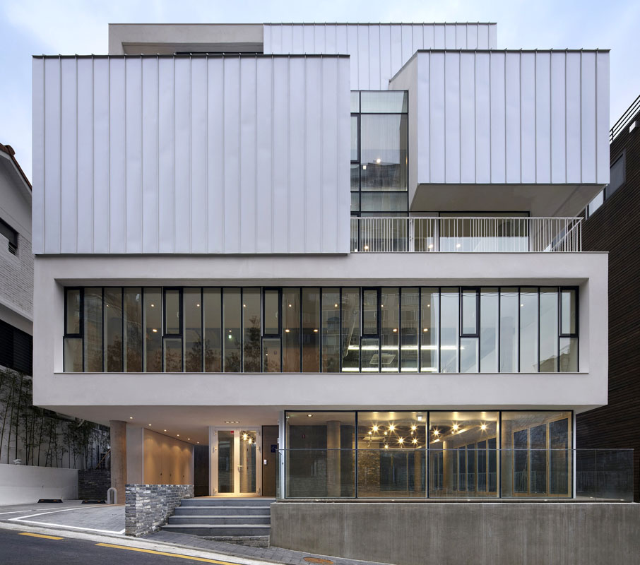
It might seem like splitting hairs (see what I did there) but, the building should be called the Cheongdam White Rabbit instead. The March Hare appears primarily at the tea party with the Mad Hatter after the White Rabbit leads her there. The White Rabbit, however, is like a decoy – he’s the surprising and interesting thing that Alice follows that leads to all her adventures in Wonderland. He first attracts Alice’s attention because he’s a contradiction – an animal, but wearing a waistcoat and a pocket watch. Intrigued by the juxtaposition of beast and gentleman, Alice hurries after him and starts her adventure. Now, on to architecture.
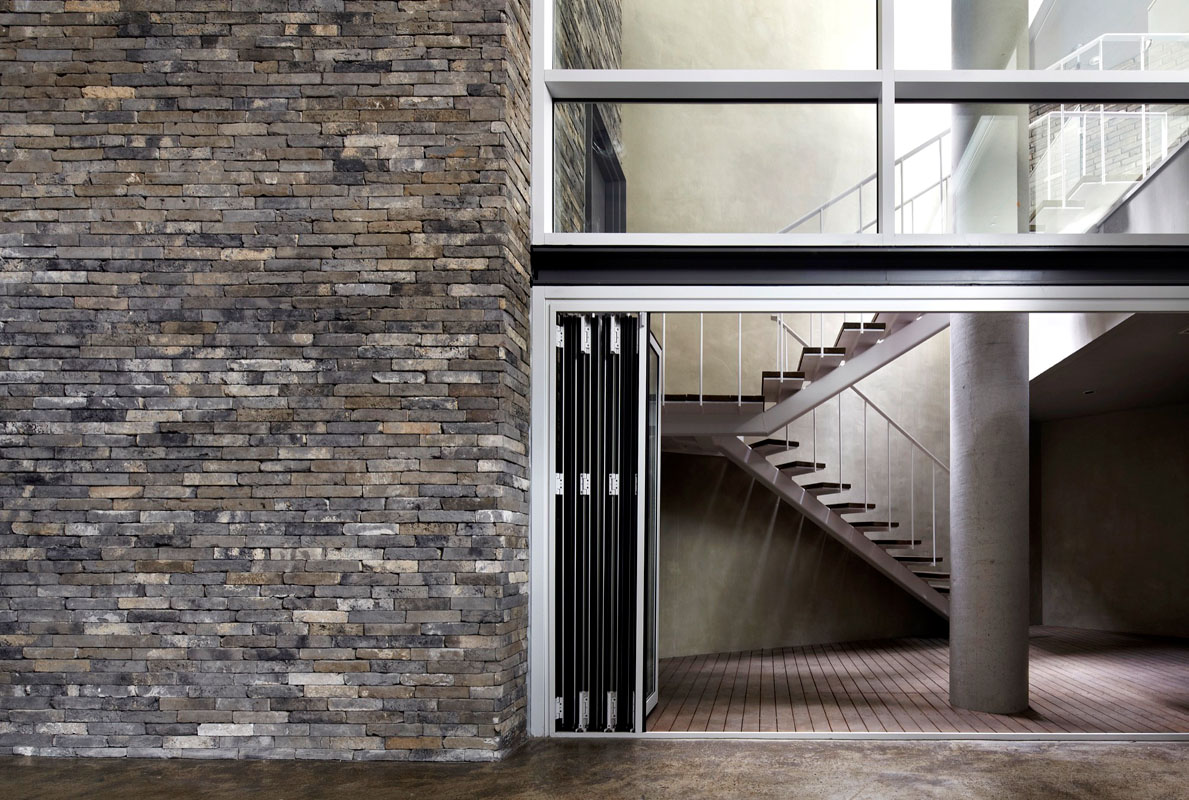
Cheongdam March Rabbit, designed by Korean architects L’EAU Design Co. is located in a busy alley of the Cheongdam-dong neighborhood of Seoul, South Korea. While wanting to remain in harmony with the area, the architects wanted to design a building that was striking enough in appearance that would spark a reinvigoration of the street and surrounding area. The structure also had to be versatile so the function could evolve with the revitalized area.
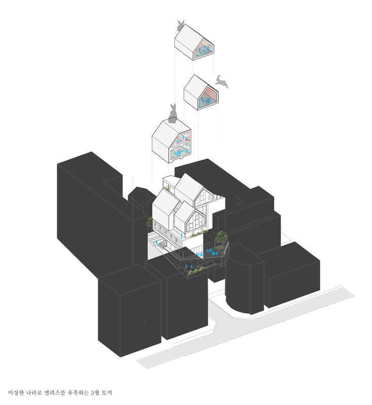
The building is vertically stacked to produce six floors which can be adapted to uses ranging from offices and retail space to cafés and even residential apartments. To that end, common areas have been reduced to a public bathroom, elevators, and staircases. This creates a maximum rental space on each floor while maintaining sufficient operation of the building’s essential functions.
Drawing on the Alice in Wonderland inspiration, the volumes sometimes look like houses stacked on top of one another adding an air of whimsy to the building. The plethora of windows and white color certainly make the structure stand out from the surrounding area and acts as an inspiration for others.
[photography by Kim Yongkwan][latest articles]
Selva Restaurant: A Design Inspired Dining Experience in Amsterdam
New Home of Toronto’s Museum of Contemporary Art
Nordic Architecture and Sleek Interior Design
Charting a New Course at Compass House
