In far northern Portugal, the border between Spain and Portugal is marked by the River Minho. Where the river meets the Atlantic Ocean lies the small town of Caminha, slightly inland along the river. In addition to Gothic, Renaissance, and Baroque architecture and fabulous food the area also offers beaches, mountains, and forests for the outdoor enthusiasts.
When one such enthusiast bought a small apartment built in the 80s to use as a vacation home, they knew it was in dire need of an update. The apartment was dated, dark, and suffered from 30-years of intense use. The layout was uninviting and gave no indication of the gem by the sea it would become.

Tiago do Vale Architects was brought in to handle the interior architecture and transform this lump of coal into a shiny beachy diamond. The one-bedroom 430-square-foot apartment didn’t give them much to work with but Tiago do Vale and his team were up to making the most of the potential they saw in the diminutive space.
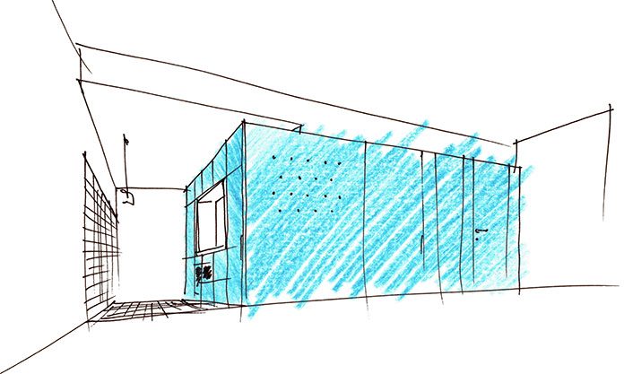
The overall strategy was to enhance the natural light and size of the apartment with a minimalist approach and by keeping most of the apartment bright, using light wood floors and white walls and ceilings throughout.

One exception is the centerpiece of the design which is a brilliant pop of sea blue color that starts at the entry, goes down the hall, and wraps around to the kitchen. This element brings in so much color and functionality in a whimsical way, bringing the summer inside and providing a contemporary vibe of playfulness to the space. The structure contains the front door, bathroom door, and becomes the kitchen cabinets.


The small kitchen was modernized with the blue kitchen cabinets with flush doors and modern appliances. It’s clean, bright, and very functional. With a nod to the 80s, the kitchen was covered with a patterned tile on the floor and up the opposite wall and the original crown moldings were kept.

Half of the wall between the bedroom and living room was taken down and a sliding pocket-wall was put in its place. When open, the apartment instantly feels much lighter and larger. When unexpected guests arrive and the bed is not made, the panel can be slid shut to hide the mess and also afford some extra privacy if those guests don’t leave.
And, let’s be honest, why would anyone want to leave this apartment. Ok, maybe to the beach and then get some food. But, then it’s right back to the apartment.
[photography by João Morgado][latest articles]
Selva Restaurant: A Design Inspired Dining Experience in Amsterdam
New Home of Toronto’s Museum of Contemporary Art
Nordic Architecture and Sleek Interior Design
Charting a New Course at Compass House


Your article helped me a lot, is there any more related content? Thanks!