When your neighbor is a castle, it’s hard not to feel bad about you living situation.
Unless, of course, you prefer a modest size domicile with an elegantly modern interior over a drafty stone castle with way too much space. Decisions, decisions.
The modest home in question is over 120 years old, built as an annex serving the castle next door located in Braga, Portugal located within the walls of the city that date back to Roman times. It is an unusual building combining typical 19th century Portuguese architecture with an unexpected Alpine influence brought by a wave of rich Portuguese returning from Brazil who was in turn influenced by central-Europeans building Brazil’s second industrial revolution in the 1800s. It’s a little hard to follow, for sure.
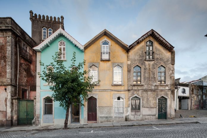
The home is one of three identical homes build together as a tri-plex (is that a thing?). Over the 120 years, the original identity of the has been chipped away by numerous ‘updates’ and small renovations. Most of them over-compartmentalizing the interior and closing it off to the street and the light.
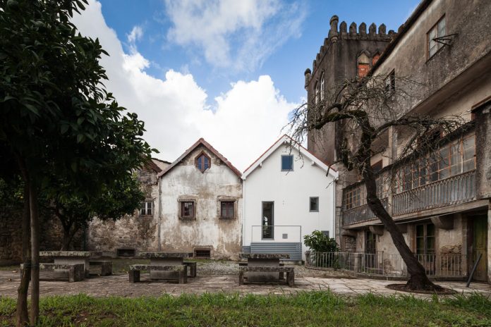
Each house is narrow but long with two fronts, one face west towards the street and the other east towards an interior plaza. The result, is the home has to potential for natural light all day long. With that in mind, the goal of the design was to clearly define the interior spaces and functions, open the interior to receive the natural light, and restore the building to its original character, while making it fit for a modern lifestyle.
To start, the façade was restored to its original design, right down to replacing the ‘updated’ aluminum window frames with the original wooden ones. The Alpine influence was reinstated with the decorative white eave and the light teal paint.
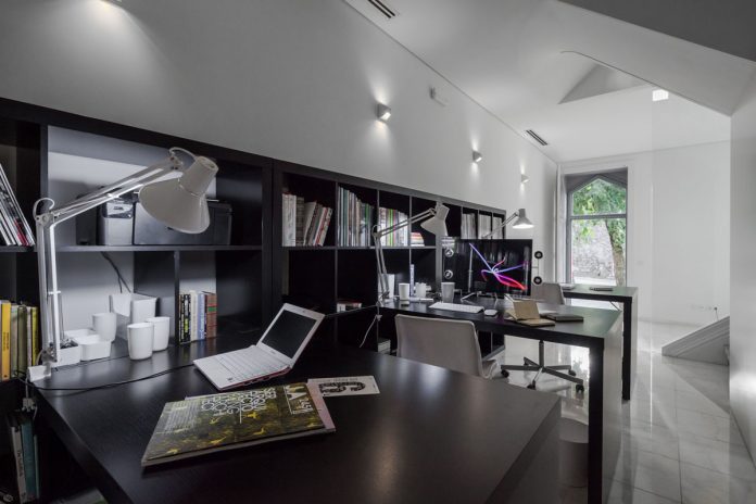
The rear plaza is about five feet higher than the street in the front. Since the design called for a live/work space, the office is on the ground floor accessible from the front door but below grade in the back, while the main living space is on the second level from the front but has a door out to the exterior plaza in the back.
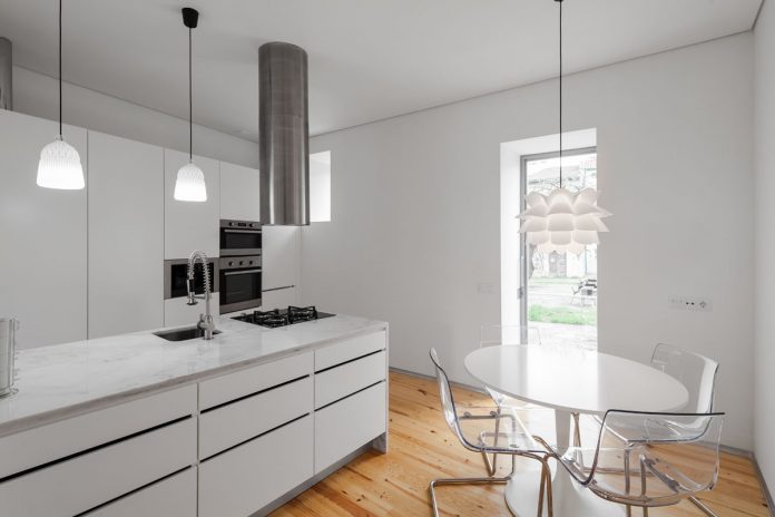
The main living area contains the kitchen, dining and living room. To keep the space open, architect Tiago do Vale designed the staircase to define the parameters of the kitchen and living room. The open floor is bathed in natural light all day as light enters the kitchen in the morning, the staircase skylight in the middle of the day, and the living room in the afternoon.
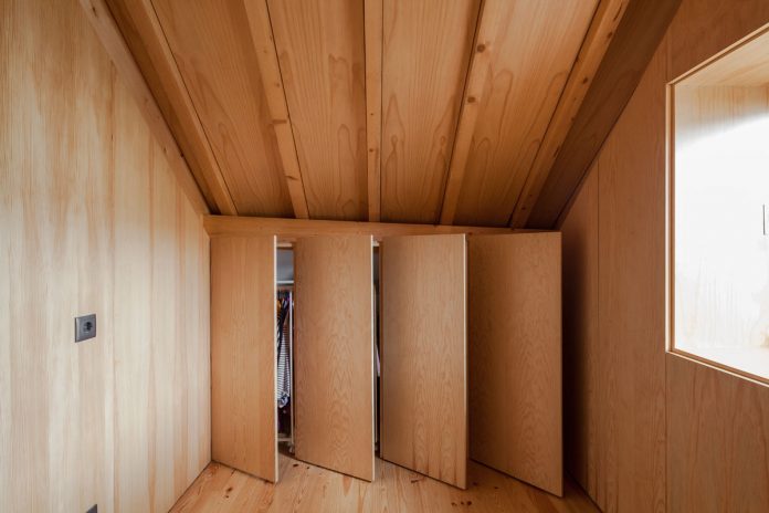
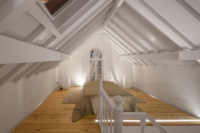
The stairway narrows as it rises to the sleeping floor of the house. There is an open, loft-style bedroom on one side of the staircase and a clothing room backed by a bathroom on the other. While the white color is repeated throughout the house on the walls, ceiling, carpentry, and marble, the walls, ceiling, and closet doors are a natural wood finish to contrast with the rest of the house.
“At it most basic, our option was to reclaim the original intent and conditions of the building but with the (fundamental) subtlety of providing an added something beyond a blind restoration. Something that could return the building to a function, to a use (whereby people could inhabit it and live a life of genuine quality), to present day, to the street, to the city, and with enough flexibility to keep it going for an extra 120 years,” said do Vale. “This is a delicate matter, though, as function, use, people, streets, cities are all things that relentlessly, unforgivingly, keep changing the way they relate with their built surroundings.”
[Photography by João Morgado][latest articles]
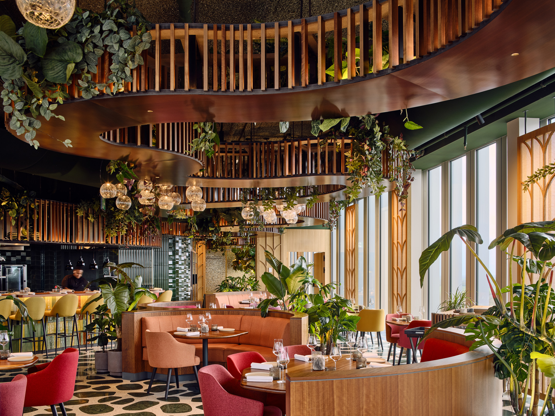
Selva Restaurant: A Design Inspired Dining Experience in Amsterdam
New Home of Toronto’s Museum of Contemporary Art
Nordic Architecture and Sleek Interior Design
Charting a New Course at Compass House
